Joomla.org Magazine Usability Testing Report

Joomla.org Magazine
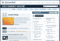
Joomla.org has a great magazine. Its editor, Paul Orwig, recently asked me to perform a usability test to find out whether it was suffering from any problems.
Paul identified three tasks:
- How do I register as an author, and is it clear that community members are invited to become contributing authors?
- How do I contribute an article?
- How do I browse all the articles for a specific topic?
We ran out of time before we reached the third task but we did cover the first and second tasks — and more. (Although there were a few sound problems during the recording, for which I apologize.)
Steve Bickel, the organizer of a Joomla meetup in San Diego agreed to help me test the Joomla.org magazine. Steve is an experienced Joomla developer who uses Joomla.org “sometimes” when he is looking for information. He’s never heard of the magazine though, so he made a perfect subject.
Part 1 – Finding the magazine and signing up as an author.
[vimeo]http://vimeo.com/16775333[/vimeo]
I first asked Steve to find the magazine, which he did easily with the search box. Between 20-30 percent of users go first to search, without bothering with navigation.
Steve’s first impression was good. He liked the headlines and the images. He assumed that he could volunteer to be an author, which is great.
He found all the information about being an author and thought it was very well organized. However, he could not find the registration form to become an author “It’s confusing!” he said. He even thought he’d have to post a question on the forum. At this point we stopped the test in order to continue with the next task.
Recommendation: Add a “Sign Up Here” button on all the author information pages. The button should lead directly to the registration form.
Part 2 – Author registration
[vimeo]http://vimeo.com/16775389[/vimeo]
We discovered the registration link during the break and started the second test by trying to register as an author.
Steve filled out the form and tried to submit it, but nothing appeared to happen. He eventually discovered that his email had an error but the error message was very subtle and needed to be clearer.
Recommendation: Add a clear error message, such as an error prompt.
Part 3 – Submitting an article
[vimeo]http://vimeo.com/16775366[/vimeo]
I asked Steve to try to submit an article. He found the “Have an article to submit? Login” banner, and logged in easily.
Once he had logged in, he expected to see a form to submit his article, but reached his profile page instead.
He didn’t know what an “item” was, although he assumed it’s “probably not an article.” He did understand the term “bucket” however, so he clicked on the “article submission bucket” and reached something that “made no sense to me.”
He then clicked on “Add a new item” and finally reached the submit article form.

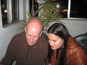
Steve and I during the usability test
I asked Steve about the purpose of the alias; he thought it was for SEO.
I asked him to add a picture. He clicked on an icon that he thought was for an image, but wasn’t. It took him a while to discover the image tab. He then clicked the browse button but there was no “Upload now” next to it, so he wasn’t sure how to finish uploading the picture. “I have no idea how to get this image there,” he said. Steve also couldn’t figure out the meaning of the image gallery or how it differed from the image itself.
He saw the “Select items” list, but couldn’t figure out what it was.
Next, Steve was ready to submit his article but couldn’t find a submit button. Even after removing the camtasia toolbar, Steve couldn’t find how to submit the form. He became frustrated and decided it was way too many “hoops” to jump. I noticed later that the save button was at the top of the screen.
Recommendations: Remove the alias field. It’s not the author’s job to do SEO and it’s unclear what they need to enter there.
Replace “item” with “Article.” Since we are asking authors to submit articles, call their submissions “articles.”
Place an “Upload image” field somewhere that’s easy to find.
Rename the “Save” button “Submit” and move it to the bottom of the article so that it follows the natural movement of the eye. I also recommend using a regular button rather than an image to make it clearer.
Conclusion:
Joomla.org magazine is nicely done but has some usability issues that are probably preventing users signing up as authors and submitting articles. These are not big issues and can be fixed pretty easily.
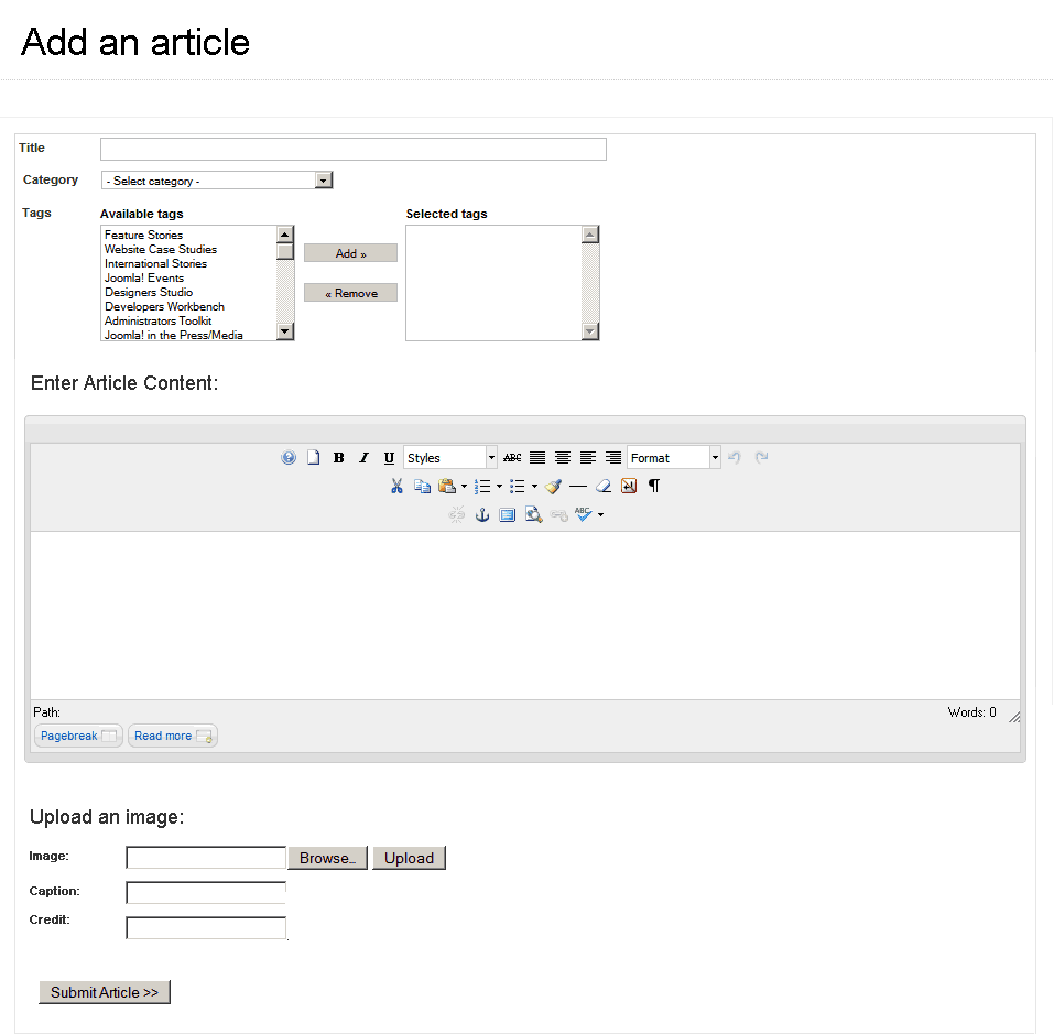
The article submission form seems to be the main problem here. It’s too complicated and should be simplified to match what people want to do. The mockup below shows only the things the author really needs. The submit button is in its natural location: at the end of the form.
Here are some last words from Steve:
[vimeo]http://vimeo.com/16851706[/vimeo]
Thank you Steve Bickel and Joomla Meetup San Diego for your help! If you’re in the San Diego area, come and join us for great information and some more usability testing. Each tester gets a free iJoomla extension!
Tags: Joomla.org, magazine, meetup


Dianne Henning
| #
A Haiku answer for both of you…
Steve and Merev, thanks!
Usability explained,
we will work on it!
This was quite informative, many thanks for your very useful comments! Looking forward to reading your future article, Steve! 🙂
Reply
Merav
| #
Dianne, Thanks for the lovely Haiku! 🙂 You are welcome, I hope it helps!
Reply
Paul Orwig
| #
Hi Merav, thanks so much to you and Steve for your work to help us improve the Joomla! Community Magazine! Your recommendations have been shared with our team and we agree you have pointed out things for us to work on. For your recommended changes, we have now either implemented them or are in the process of doing that.
Thanks again for your and Steve’s willingness to help improve the JCM!
Reply
Merav
| #
Paul, you’re most welcome, I am looking forward to seeing the positive changes!
Reply
Joomla! Community Magazine – December 2010 Issue Released - Timby's Tech Talk
| #
[…] have made some usability improvements based on recommendations offered by Merav Knafo in her Joomla.org Magazine Usability Testing Report. Thank you Merav and Steve Bickel for your willingness to take a look at the JCM and point out some […]
Reply
Joomla! Community Magazine – December 2010 Issue Released | Joomla
| #
[…] have made some usability improvements based on recommendations offered by Merav Knafo in her Joomla.org Magazine Usability Testing Report. Thank you Merav and Steve Bickel for your willingness to take a look at the JCM and point out some […]
Reply
Joomla! Community Magazine – December 2010 Issue Released « Miami Beach Web Designer
| #
[…] have made some usability improvements based on recommendations offered by Merav Knafo in her Joomla.org Magazine Usability Testing Report. Thank you Merav and Steve Bickel for your willingness to take a look at the JCM and point out some […]
Reply
Joomla! Community Magazine – December 2010 Issue Released
| #
[…] have made some usability improvements based on recommendations offered by Merav Knafo in her Joomla.org Magazine Usability Testing Report. Thank you Merav and Steve Bickel for your willingness to take a look at the JCM and point out some […]
Reply
Joomla Coders » Blog Archive » Joomla! Community Magazine – December 2010 Issue Released
| #
[…] have made some usability improvements based on recommendations offered by Merav Knafo in her Joomla.org Magazine Usability Testing Report. Thank you Merav and Steve Bickel for your willingness to take a look at the JCM and point out some […]
Reply
Joomla! Community Magazine | Quizz CMS
| #
[…] have made some usability improvements based on recommendations offered by Merav Knafo in her Joomla.org Magazine Usability Testing Report. Thank you Merav and Steve Bickel for your willingness to take a look at the JCM and point out some […]
Reply
Joomla! Community Magazine – December 2010 Issue Released | Tech Com Pro
| #
[…] have made some usability improvements based on recommendations offered by Merav Knafo in her Joomla.org Magazine Usability Testing Report. Thank you Merav and Steve Bickel for your willingness to take a look at the JCM and point out some […]
Reply
Joomla! Community Magazine – December 2010 Issue Released | Web Design Directory | Joomla Directory | Joomazing
| #
[…] have made some usability improvements based on recommendations offered by Merav Knafo in her Joomla.org Magazine Usability Testing Report. Thank you Merav and Steve Bickel for your willingness to take a look at the JCM and point out some […]
Reply
Joomla! Community Magazine
| #
[…] have made some usability improvements based on recommendations offered by Merav Knafo in her Joomla.org Magazine Usability Testing Report. Thank you Merav and Steve Bickel for your willingness to take a look at the JCM and point out some […]
Reply
Joomla! Community Magazine | Joomla Showcase : CSS Showcase
| #
[…] have made some usability improvements based on recommendations offered by Merav Knafo in her Joomla.org Magazine Usability Testing Report. Thank you Merav and Steve Bickel for your willingness to take a look at the JCM and point out some […]
Reply
Cash Flow Trader
| #
One of the best JCM I’ve seen to date. Looking forward to testing it out myself.
Reply
Joomla! Community Magazine | OMG-Gurubootcamp!! Open Source
| #
[…] have made some usability improvements based on recommendations offered by Merav Knafo in her Joomla.org Magazine Usability Testing Report. Thank you Merav and Steve Bickel for your willingness to take a look at the JCM and point out some […]
Reply
bing.Com
| #
At this time it appears like WordPress is
the top blogging platform out there right now.
(from what I’ve read) Is that what you are using on your blog?
Reply