How NOT to create landing pages for mobile traffic
Sometimes I do wonder if some companies are run by monkeys. Take CA ( ca.com), for example. I won’t go into why their products are some of the worse I’ve ever used, why their customer support is beyond a joke, how their anti-virus messed up my computer for months, and why they acquired a great Outlook plugin called Qurb, merged it into their garbage products and won’t sell it as a stand-alone program anymore.
I will talk about their mobile ad strategy though. Or the lack of it.
Browsing mashable.com on my iPad today, I spotted an intriguing ad for something related to Usability Testing (my favorite topic). I clicked the ad… and reached the CA website, to my dismay.

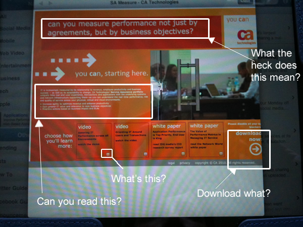
Photo of my iPad with the landing page on ca.com
Now, you might think that if a company purchases ads that show on mobile devices, they’d direct the user to a mobile-appropriate page. Not CA! There were all sorts of problem with the landing page:
- The font was tiny, and used white text on an orange background. It was impossible to read even on an iPad.
- Four boxes at the bottom of the page looked like a mistake. I thought it was a broken plugin image, or video that wasn’t able to play on my iPad. It wasn’t. It was just how these boxes appear. Another tiny box on the right was intended to… do something. I’ve no idea what.
- The call to action begged me to “Download Now.” It didn’t bother telling me what I’m downloading though or explain what use it might have for my iPad.
- The page also suggested that I “Please disable all pop-up blockers.” First, if you expect people to disabled their pop up blocker just so that they can download your stuff, you are asking too much, surely you can find a better way, if not, maybe you’re in the wrong business. Second, I can’t even do that at all on an iPad, but again, you don’t really know I’m on my iPad, do you.
- And as for the copy writing — the one title that I was actually able to read – Read it for yourself and let me know if you understand what it means and what exactly they are selling.
For CA, the whole ad was a waste of money. For the rest of us it’s a useful lesson. If you’re investing in mobile traffic:
- Create a special landing page just for your mobile traffic.
- Make sure that the page is easy to read ON a mobile device and communicates what you’re selling.
- Give a “call to action” that makes sense for that mobile device.
What’s your mobile ad traffic strategy?
