Top 10 Joomla Beginner Mistakes and How to Avoid Them
 You know how it goes. You create a fantastic Joomla website with great architecture, awesome usability, clean code and optimized images, and when you’re done, you hand it proudly to your client with (hopefully) some explanation of how to use the site’s backend. I usually create a video tutorial that explains how to perform the basic features.
The client is happy, you get paid, and you move on to the next project. A few months later, when the client comes back with some questions or wants you to upgrade or add some features, you notice that the site is not quite as clean as it used to be, not as optimized as it used to be, and so on. In fact, it’s kinda messy and crappy. Not a site you’d like to sign your name on or to have in your portfolio.
What went wrong?
Joomla is great because it empowers even non-designers to manage their sites themselves. The problem is that those customers, in their effort to run the site without bothering you, make mistakes.
During the years I’ve been developing Joomla sites, I’ve noticed that some of these mistakes repeat themselves. If those clients knew just a little about what to watch out for as they start using their new site, maybe they wouldn’t make them.
Feel free to send your customers this post to help them avoid these mistakes.
1. Links to outside sites open in the same window.
There’s a very simple rule here: all links to external sites should open in a new window, not the same window. You don’t want to lose that person forever. If a user clicks to a new site in the same window, they’re gone. All HTML editors have the capability to choose “new window” when creating links. If you are linking inside the site however, you should usually open the link in the same window (this is the default). Leave too many windows open while the user browses the site, and they’ll end up with a messy browser.
External site: New window. Your own site: Same window.
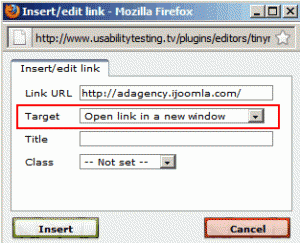
Choose to open the link in a new window, if you're linking outside your site
2. File names should be descriptive.

red_rose.jpg
Let’s say you create some images of flowers to upload to your site. You could call the images “1.jpg,” “2.jpg” but these names will make it hard to find, and search engines won’t know what to make of them. Even “flower1.jpg” is not good enough. The more specific, the better. For example, “red_rose.jpg” is a great file name. This is not only good for usability (it’s easy to know what the image is without having to open it) but it’s also a great way to get free traffic from Google when people search for images of a red rose.
3. Not resizing images.
One big flaw of Joomla is no ability to resize images; that’s your job. Of course, you don’t need to resize the image. You could upload a gigantic image and resize it on the HTML Editor interface by dragging the corners. But large images take longer to load, and that picture will still load as a large image. Speed is important, so if you want to keep your site speed down, you must resize the image before you upload. There are many tools for resizing images. www.shrinkpictures.com is a good one for beginners but any image editing software, such as Fireworks, can do the job too.
4. Having spaces in file names.

lady_gaga.jpg, not lady gaga.jpg
When you create a file, any file, be sure to use underscores instead of spaces.
So a photo of Lady Gaga should be named: “lady_gaga.jpg” and not “lady gaga.jpg.” Use a space and the characters “%20 “ will replace the gap when the browser reads the file. This creates a messy code and can create unpredictable problems. Here’s a great article about the best practices for creating file names:
www.thesitewizard.com/webdesign/create-good-filenames.shtml
5. Placing all the images in the same folder.
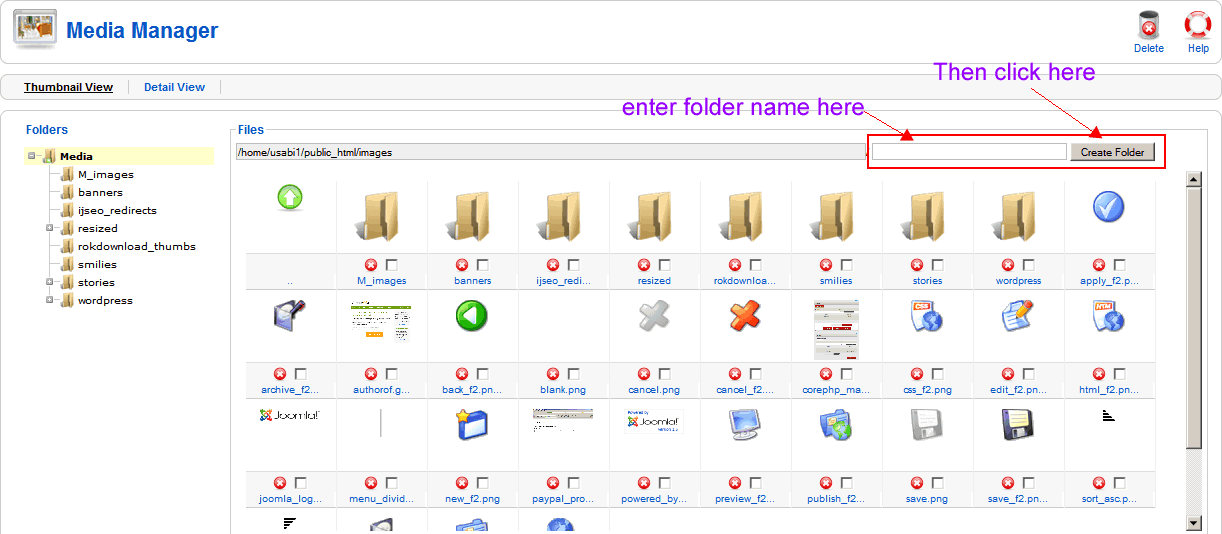
Joomla allows you to create new folders according to topic under the images/stories directory. For example, if you have an “about us” page with photos of your team members, create a new folder, call the folder “team” and place their images there. Place all your images in the generic images/stories/ folder and in no time you’ll be struggling to find your images when you want to add them to your articles. Keep your images organized by topic. And of course, no spaces in the folder names!
Some HTML editors will let you do this on the spot, when adding an article, but the default HTML editor that comes with Joomla, won’t. So you’d have to go to site->media manager and add a new folder there.
6. Not using the available heading for text formatting.
Every template has a style sheet file (CSS file) with headings for formatting. The title of your article is already formatted by Joomla but the rest of the article usually needs some more headings to break the block of text.
There are two ways to do this: the right way and the wrong way. The wrong way is to highlight the title, choose a font, choose a color, choose a size, click the bold button, and center it. It works but it creates messy code and it’s hard to maintain. If you wanted to make all the titles inside the articles green, not bold and in Arial font, for example, you’d have to open each article and make each change manually. That could take a while.
The right way to format text inside your articles is to use headings. This will create clean code and if you decide to change the way the headings look, all you’d have to do is open the CSS file and make the change once. (That’s not for beginners but you will get there eventually).
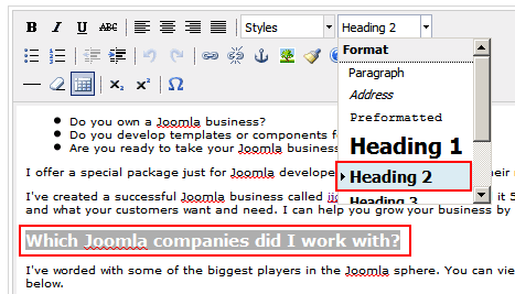
Select one of the available styles, especially the headings style
7. Typing directly into Joomla.
When you login to your Joomla admin, you start a session. The length of the session is set to 15 minutes by default but can be changed on the global configuration page. Start typing an article directly into Joomla then and your session will end before you’re finished writing. When you try to save your work, you’ll lose it. Trust me… been there, done that. It’s not fun. The solution is simple: write it in Word, save it, then copy and paste it into Joomla. But be careful…

You've got 15 minutes to finish typing , or else...
8. Copying directly from a Word document to Joomla.
This is a very big mistake that can take your site down (I’ve seen it!). Creating your site’s copy in Word is a very good idea but copying from Word directly into the Joomla HTML editor produces messy, bloated code that Google hates and which can mess up your site. The solution is simple: strip out the code by copying the text into Notepad first, then copy from Notepad into Joomla. Notepad is easy to find on your PC under “accessories.” I’m sure Macs have a similar program.
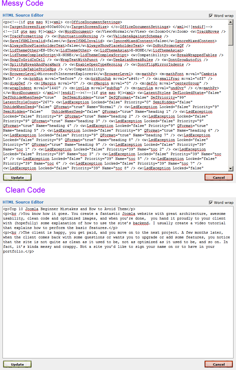
Copying from Word directly into the Joomla HTML editor produces messy, bloated code that Google hates
9. Adding underline to text that is not a link.
Text should only be underlined if it’s a link. People are used to clicking on underlined text. They see an underline so they assume it’s a link. If you need emphasis, use bold, italics, a different color, all caps, or a bigger size. But don’t use underline.
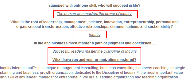
Text should only be underlined if it’s a link
10. Hard coding links.
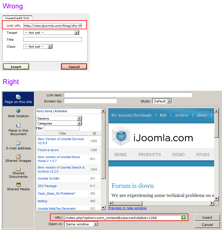
There are two ways to link to a location on your own website. The wrong way is to find the article on your site, copy the URL from the browser window and use this link when creating a hyperlink. It’s messy, and if you move your site, change the article’s title or change your SEF extension, you’ll be in trouble.
The right way is to use the HTML editor to link to the article or menu item. The HTML editor will know the right URL to use in a way that doesn’t mess up your site. Make sure you always choose “relative” in the HTML editor settings, if available. The basic Joomla HTML editor doesn’t allow you to do this the right way, choose an HTML editor that does (My favorite is WYSIWYG Pro).
That’s it! If you follow these practices when working on your Joomla website, you’ll be in an excellent shape, and in time, all this will become second nature. Remember, we all started at the same place you are today, and we all made the exact same mistakes. I hope this helps.
Web designers, what are the biggest mistakes you see when handing a site to clients? Please add yours below.

Hans Kuijpers
| #
What a nice list to hand over to fresh Joomla users. But I don’t agree with your first point. You state that one always should open external links in a new window. That discussion is on for years now. Should you or should you not open an external link in a fresh window.
Feel free to read the discussion about this topic on SmashingMagazine -> http://www.smashingmagazine.com/2008/07/01/should-links-open-in-new-windows/
Reply
Merav Knafo
| #
They make some good points in that article, but still, losing your visitor to an external site makes no sense to me, so I am keeping this point 🙂
Reply
Ryan
| #
Regarding #1, I’ve noticed some pretty big sistes doing this – external links opening in the same window. The biggest one is Drudgereport – they lose me as soon as I click on a single story. Ive always wondered if there was a hidden motive for doing it that way?
Reply
Merav Knafo
| #
No hidden motive, just ignorance 🙂
Reply
Matt Lipscomb
| #
What I personally often find that new users “miss” is some very core basics of protecting their site. Specifically, making sure you stay up-to-date with the latest Joomla version and also stay up-to-date with the latest extension versions. I would go further to say that 75% of the client sites I am hired to “fix” – need fixed because they let things get so “behind”.
Reply
Merav Knafo
| #
Totally agree with that. The best way to get hacked is to be behind on your updates.
Reply
Mike
| #
Nice article, very useful for new users, i wish i read it few years back, it would have saved me lots of time 🙂
Keep up the good work…
Reply
Merav Knafo
| #
Thanks Mike, do send it to newbies, they need all the help they can get 🙂
Reply
Eric Caldwell
| #
One thing on the Word copy/paste. We have been battling this for years with our clients and that’s one of our first training items now along with explaining how images work on browsers along with how tables work.
To combat the bloated HTML paste issue, we install JCE on every site and the first thing we show people how to do is use the “Paste as Plain Text” feature in JCE. No need for external text editors 🙂
Reply
Jamie Robinson-Woledge
| #
A good foundation article and I agree with Matt, I know many Joomla developers who don’t even know the basics of site security and rarely keep up to date with core updates. Also in regard to Pt. #1 from the very infancy of WWW the golden rule was internal links same page, external links new page. The Smashingmag article and backup research is a surprise to me. A quick thought how about a compromise and all external links open a modal window? how would that effect SEO?
Reply
Andrew Rogers
| #
Well written there! It’s nothing new and these tips has long been there for us. About opening new window for external sites, it has been my rule of thumb to keep visitors to my site. What you wrote is specifically useful for Joomla users and wanna thank you for sharing it.
Reply
Danny
| #
One main thing is that majority of clients are “novices” they do not understand the simple reasoning why things are being done a certain way. For instance explaining that copying/pasting from Word will create messy code with the WSYWIGS. It can get frustrating working with clients and having them understand a lot of the basic things. Some don’t take the time out to learn. I work for one of the biggest sites in the US and our publishers who responsible to update articles and front of the site are required to have HTML/CSS and web knowledge because of all the mistakes and not knowing. I say they should hire someone that knows how to publish in the joomla environment
Reply
Steve Pullinger
| #
This is a great list, I was reading through it thinking “Yep, had to tidy that up”.
I really noticed this lately as I’ve been adding customer sites to our showcase and having to go through and tidy them up before linking them.
One thing about pasting from Word; if you use JCE for your Editor, the current version automatically strips out the messy Word code which saves a trip to Notepad.
Reply
Matan
| #
Hi Merav, Great article but I can’t agree with your first determination.
I think it’s really bad idea to make links open in a new window. It’s bad for the user experience because the user lose the “Back” button functionality and this is the most common action users useing in browsers.
Reply
Merav Knafo
| #
The problem is that if you “get lost” in the new site, you’d have to click back again and again and again. Most people will give up after once or twice. That being said, this is an issue worth doing usability testing for 🙂
Reply
jayasmmita
| #
Hello Merav,
Very useful tips shared by you & it helps a lot. But i have some doubts could you please tell me about how can i add the events of js like onclick,onkeyup etc in joomla template.
Reply
Barb
| #
Great collection of tips.
I also routinely install JCE, and then take away the font, font-size, font-color, etc. editor buttons — it makes it easier to keep the client out of THAT particular trouble, anyway.
Reply
Chris - ClickWebDesign
| #
Definitely a few classic gothcha’s there. Image resizing is a real drawback. I’m surprised there’s even a debate about external links opening in the same window – I agree with the authors views.
Reply
Adi
| #
Thanks for this awesome list. I plead guilty of doing at least half of them.
Reply
tahsin352
| #
wow some post. very helpful post. this is also applicable for mobile devices. you can see the latest book on mobile web development with Joomla!. see the book <a href=”http://newdailyblog.blogspot.com/2012/02/joomla-mobile-development-beginners.html”>Joomla! Mobile Web Development</a>.
Reply
Gareth
| #
Great article that I wish I found with my very first site development – about 8 years ago, but alas, I finally got all these through blood and sweat and banging my fist onto the mouse. Anyway, from my side: Links going to another domain url should open in a new tab/window so that you don’t loose the visitor when they close the page. Always provide breadcrumbs so that the back arrow is not used – make it easier to navigate and not lose the loose the visitor once again. This is all matter of opinion, but my sites are developed around what ticks me off when I visit a site – don’t make the same mistakes as others
Reply
Hira
| #
Thanks for the Nice Tips, It really helped. Can you please add more tips in your article? regarding indexing, speed .
Reply
DJ
| #
Great arricle. I’ll be sure to apply these rules to myself, lol. Sorry for the off topic queation but is this Jomsocial?
Reply
Mobiele Applicaties Development
| #
Building a website seems like a daunting task, but if you break it down into its steps. There are quite a few free website templates which you can use, such as wordpress.org, dotnetnuke.com or joomla.com. These can easily be set up by any one and should not take longer than a day to do so.
Reply
tshering
| #
please suggest me how can i enable save and close button in ijoomla template
Reply
kiedar
| #
Hi,
Why is it that whenever I try to edit an article or create one, or to edit anything from the admin dash board it redirects ne to the home page without making any changes?
Reply
Srp
| #
Is there any free joomla template for directory listing site.
Reply
Kaushal Patel
| #
Good list for Joomla beginners. It can help anyone who is starting with joomla programming. These are very basic mistakes any developer can make. Sometimes even experienced programmers do some of them. Few of the mistakes i found which programmers often make are. not giving H1 tag perfectly, avoiding alt tag, naming files with spaces, using inline css and javascripts, forgot to give noticeable color to hyperlinks etc. This kind of lists can help all of them.
Reply
Amit Patel
| #
Hello Merav, these are great tips for any developer who don’t want to meshed up their coded website. It really is a headache for a developer one the site owner do modification in website. I will surely send this link to my clients so that they can have idea about what to do and what not to do.
Reply
dehinde ikudaisi
| #
Hey!!!! I am new to websites building. I am found joomla intimidating. It is herculian task getting its open source modules install. Any way I just got on the platform now. Your tutorial is awesome. Iquite appreciate you in making the life of new entrant into joomla very easy
Reply
waqas khalid
| #
thanks for great article.
Reply
Bruce
| #
Great article, but I wanted to point out one thing that I would not do. That is adding an underscore between words in a file name is not a good practice. Always use a hyphen, otherwise several things will happen and none of them are good for SEO. What surprised me is the link in your article (item 4) on how to name files contradicts what you said and that author had several reasons why to never use an underscore in a file name, all of them correct. If you run Google analytics/webmaster tools you will get a report on any filename with an underscore and they will want you to replace it with a hyphen, otherwise Google will doc you some points in your SERP results. Run any good SEO tool and it will immediately flag file names with underscores and of course as you pointed out spaces between words.
Reply